LYCEUM SCHOOL: EDUCATIONAL MURAL DESIGN project
A CMYK MURAL IN A FORMER PRINT SHOP TO EDUCATE ON COLOUR THEORY
“For this colourful art piece, we were asked by a local London-based primary school to design an educational, parent-facing mural which represented the core values of the school.”


For this colourful art piece, we were asked by a local London-based primary school to design an educational, parent-facing mural which represented the core values of the school.
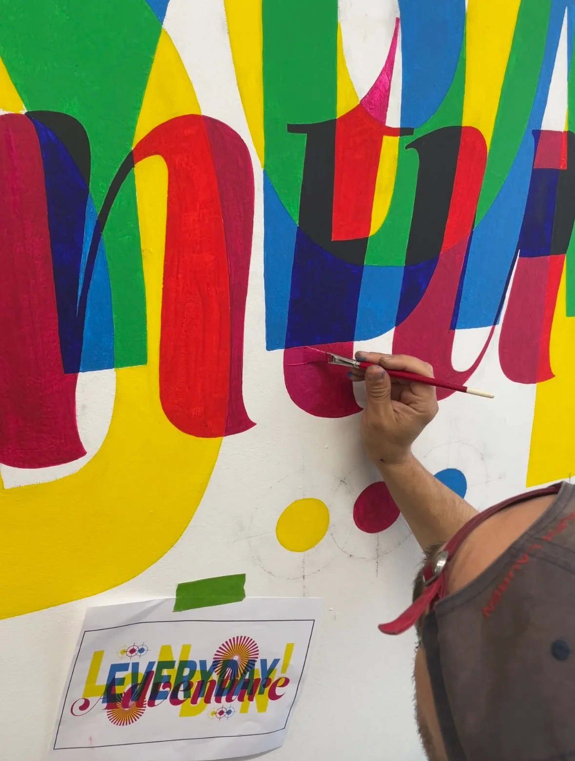
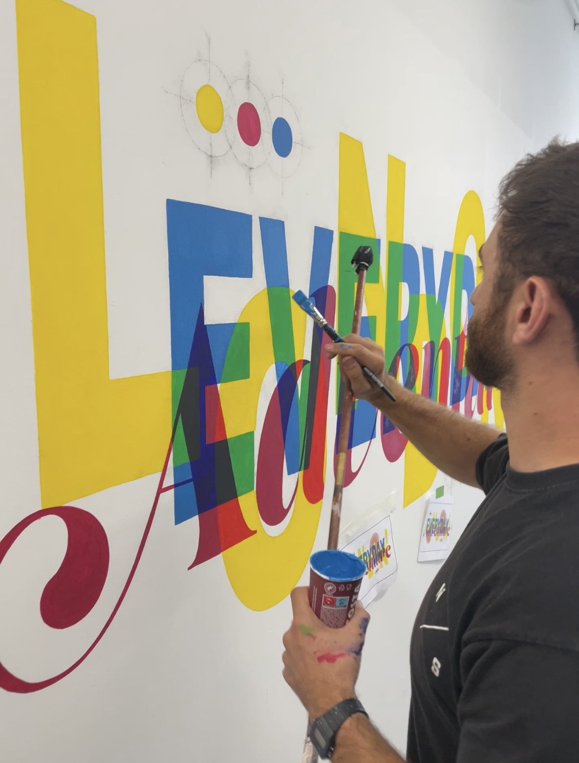
Inspired by the printing press that was historically located in the building, we wanted to create a letterpress-style design that celebrated the traditional CMYK printing process technique, used by printing companies, publishers, magazines, newspapers, graphic designers and pretty much all colour printed materials. A process that no doubt would have been used in the buildings original use.
CMYK is an acronym for the four colours used in the printing process: C - Cyan (blue), M - Magenta (pink), Y - Yellow and K - Black (when the other three colours are aligned, they create a Black Plate or Keyline, which is where we get the abbreviation ‘K’)
The words ‘London’ ‘Everyday’ & ‘Adventure’ represent the schools ’s core value that London is both their playground and their classroom. The words layer over each other, incorporating registration marks which are used in the printing process to precisely line up each colour so that their overlap creates the full colour spectrum.
